Project description
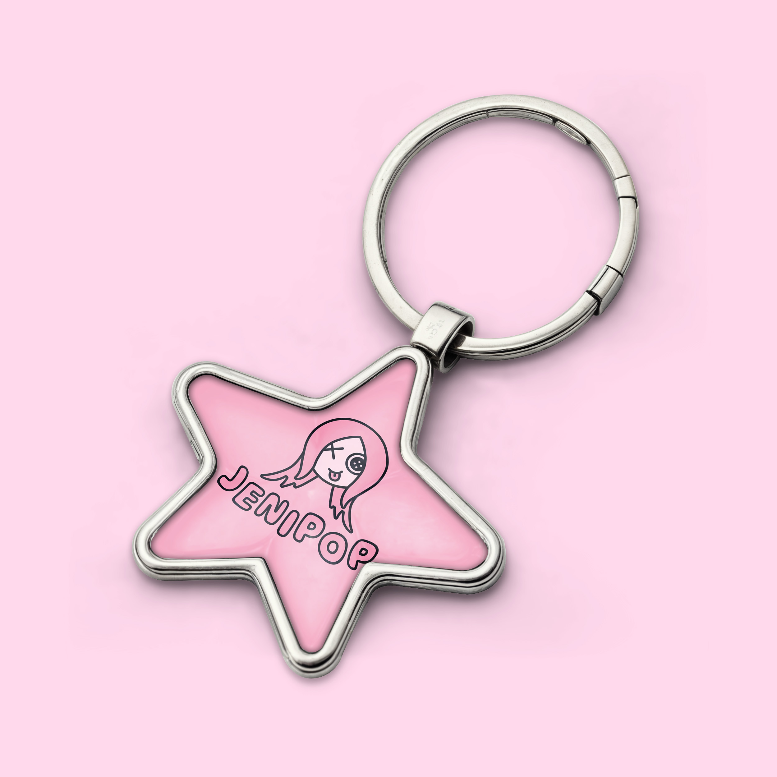
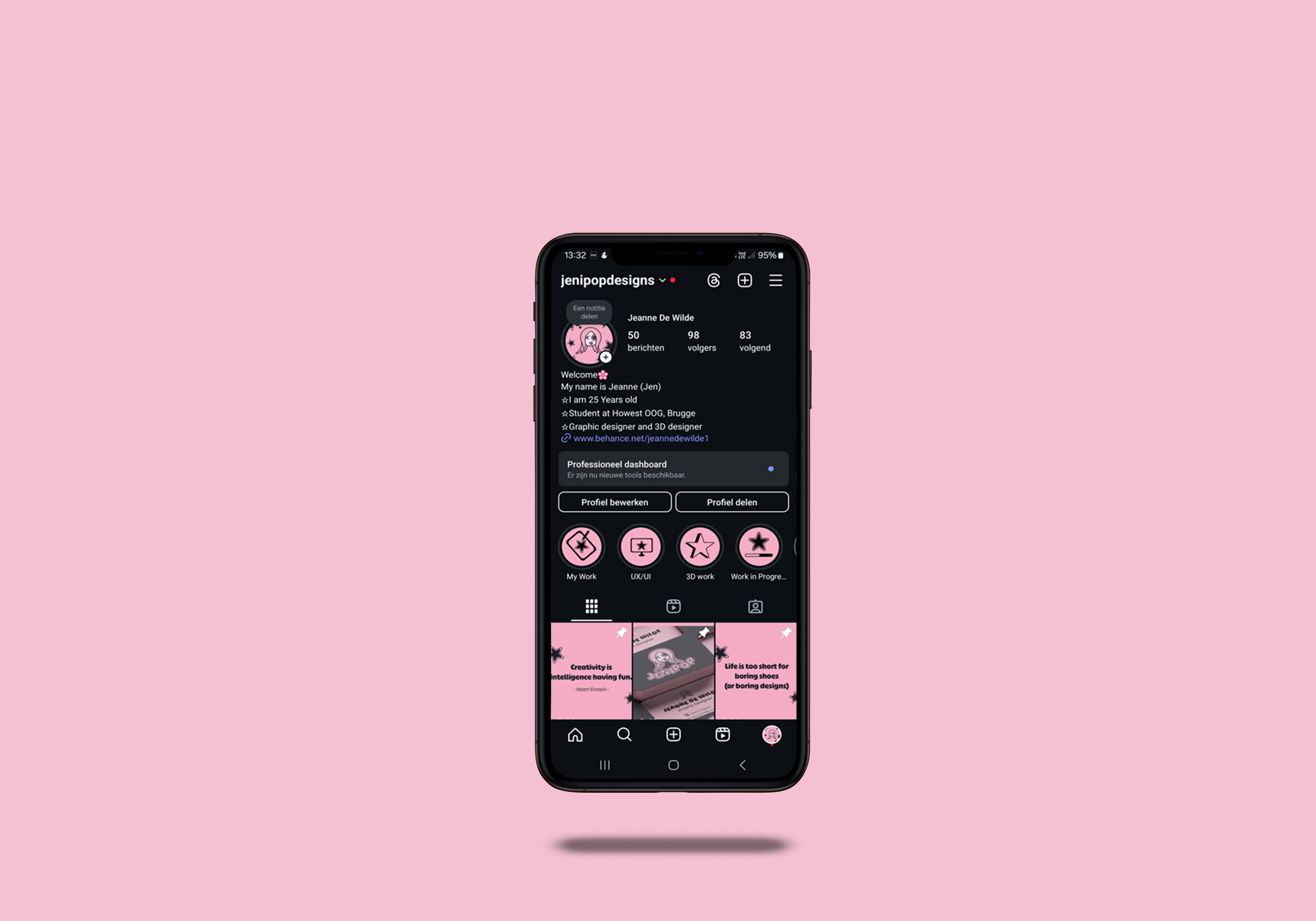
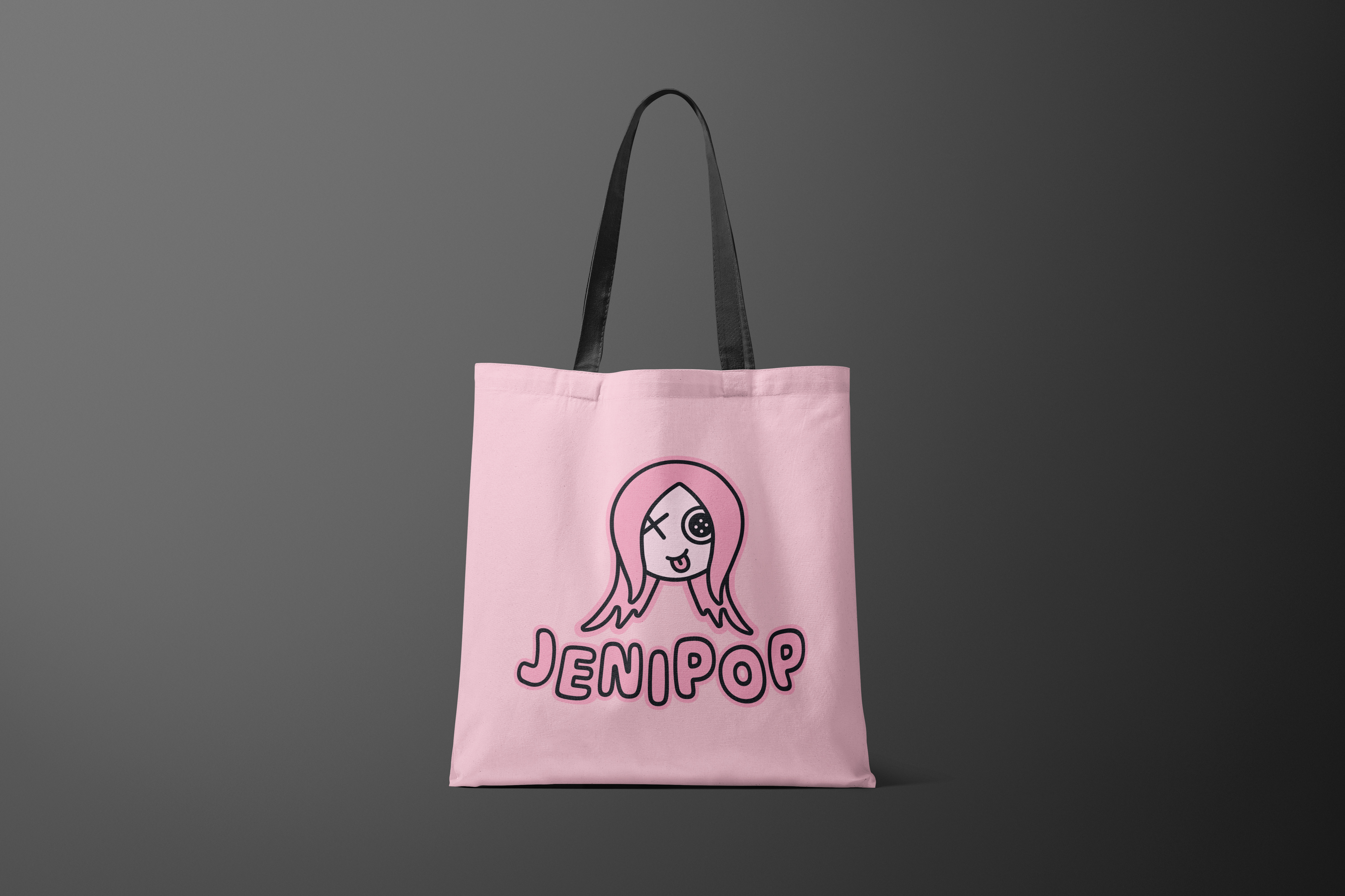
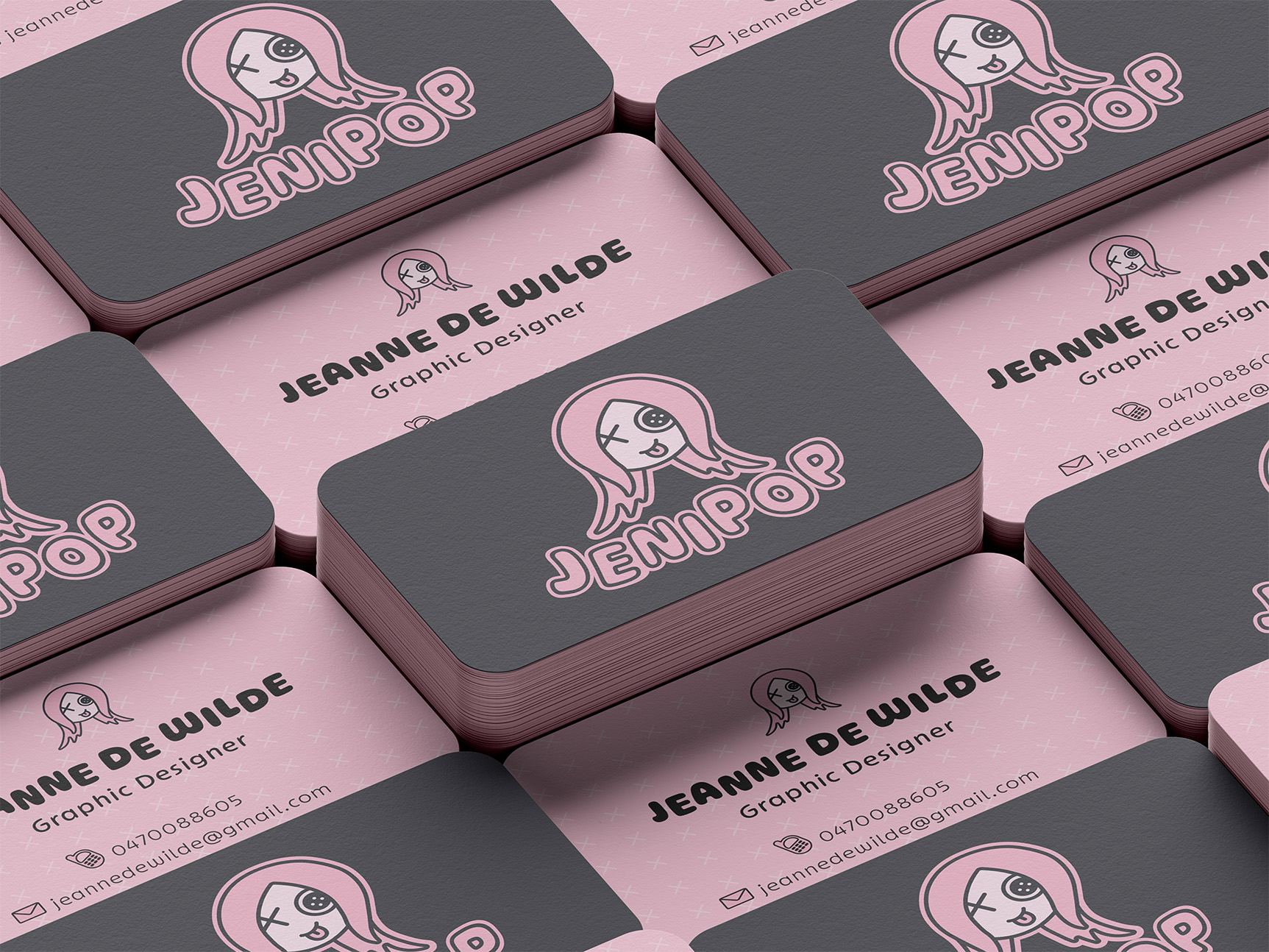
My personal branding for JeniPop represents a perfect fusion of playful charm, cute aesthetics, and rebellious edge. The logo embodies this unique personality through a carefully balanced combination of bold and soft visual elements, creating a distinctive bubbly aesthetic with just the right hint of edginess.
The color palette was thoughtfully chosen to reflect this brand personality: a soft pink as the primary color that conveys warmth and approachability, complemented by a black with a subtle blue tint for the logo outlines that adds sophistication and edge, while a pale pink accent for facial features maintains the gentle, friendly appeal.